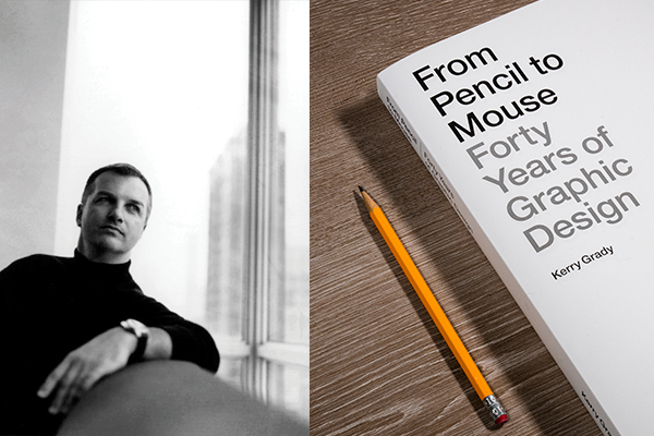
We recently had the honor of speaking with award-winning Chicago designer Kerry Grady about his new book From Pencil to Mouse: Forty Years of Graphic Design. Filled with examples of his own work from the last four decades, the stunningly printed 400-page collection addresses such topics as growing up in Iowa, the criteria for good design, Swiss modernist design influences, how technology has impacted the progress of design and the relationship between designer and client.
Moderated by Andrew Dembitz of Resource Engine Group and Karin King of Sylvamo, the discussion touched on both the book and Kerry’s lifelong pursuit to uphold timeless design principles in an ever-changing world. For those who weren’t able to attend the live event, we’ve transcribed the conversation here, slightly edited for length.
Accent® Opaque: This is the first and only (so far) collection of your work. Why a printed book, and why now?
Kerry Grady: I actually got the idea about five years ago. I was shifting some things around in my studio and I had a whole bunch of print samples — annual reports, books, brochures, etc. — that I didn’t know what to do with. One of the things I discovered in my stash was a record album from 1982, and I thought, this is pretty good work, and it still stands up. (I showed the team and they said, “What is it?”)
But that got me thinking: what else have I done that maybe I forgot about?
The book is a chronology of work that spans 40 years. My principle is always to design well, no matter what the parameters are or what the application is, and the goal with the book was to make sure that every entry stood up to those standards of timelessness and quality. I own a lot of design books, most going back to the 70s and 80s. I wanted to write a book that I would buy.
It took about four years to do — partially because of the pandemic — and it almost killed me. It was the hardest project I’ve ever taken on because of those standards, which I think are critical. Everything in the book had to stand up to that critique.
AO: What were some other challenges you encountered while making the book?
KG: One challenge was the variety of samples I wanted to include, from print samples to 35mm film copies and 8x10 film, and over time some of the quality of those samples had been diminished a little bit. So I thought, I have to recreate this. So the task was to use technology to regenerate a lot of that original work, some of which I only had one copy of, and to make it a cohesive whole.
An even bigger challenge was to write about it! Along with including information about each project, I wrote about my design philosophy and my influences.
AO: What are some of the design tenets that guide your work?
KG: Good design is timeless. Good design is not dependent upon a particular application or client. Good design exists where there is skill and there is thought.
AO: How did you become interested in design?
KG: Growing up in Iowa, design wasn’t part of the conversation, but I was drawn to creative things, and I was pretty good at it, so I got attention for it. From there, I kind of fell into design. My mother worked for a furniture company based in my hometown, and she told me to talk to this guy named John Cork who was a product designer. He said, “Hey there’s this thing called graphic design,” and I thought, what’s that, designing graphs? He pointed me in the direction of the University of Illinois and I still didn’t know what I was doing but I was willing to take a risk.
The real turning point came when I got the list of books I would need for my first semester, which included classes like Intro to Graphic Design and Typography. One of the books was Emil Ruder’s book Typographie. It was square, black-and-white, sans serif, no photos. And I thought, I like this. This resonates.
AO: Who are some of your design influences?
KG: I mentioned Emil Ruder. And then there were some other Swiss designers from the same time who had shared principles, and maybe different applications. I’m thinking of Armin Hofman and Josef Müller-Brockmann. They all had the same kind of Swiss approach to good thinking and clarity, and they all had modernist ideals: it has to make sense, there has to be a purpose. It’s not about style, it's more about solving a problem.
Another influence was Paul Rand, who, in my view, defined graphic design as an American. He was a unique person with a bold and emphatic view about what was good (and what was not good) when it came to design. And he demonstrated it.
Saul Bass was another American design influence. He did some logos that are still out there today (and the ones that were replaced should never have been replaced). Herb Lubalin was a New Yorker with a very different style, but was a true typographer — hand drawn, very expressive. He had a point of view, and he didn’t take himself too seriously. Those were the mentors or icons of design that I looked up to.
AO: You included Mies van der Rohe’s famous saying “Less is more” on the back cover of the book. Can you speak to how this modernist idea has influenced your work?
KG: Well, some people might say less is bore, and I get it; there’s nothing like going into a cathedral and experiencing the exuberance of decoration. But what I do as a graphic designer is try to get to the essence, and that’s not easy. It’s done by editing, until everything matters and everything is in its place. When it’s done well, it’s exciting — and it lasts.
AO: You’ve worked with so many well-known companies — Sprint, IBM, Sara Lee, Motorola — as well as large nonprofits like the Chicago History Museum. Can you tell us about one of the most fun projects you’ve been a part of?
KG: MB Financial was one of the most enjoyable long-term client relationships I ever had. The person who hired me needed a lot, and he didn’t know exactly what he needed, but he trusted us to get it right and didn’t interfere with our design.
Over about a dozen years, we did everything for them as they grew, including their brand identity, identity extensions and spinoffs. We did every ad, every radio spot, every sign and every handout. They went from one or two banks to 130, all in the Chicagoland area. As they grew, we grew. They didn’t require a lot of data from us, because they saw the results of the brand; they said, “People like us!” It was a win/win all the way through.
AO: This book covers 40 years, and graphic design has changed a lot during that time. What are some of the biggest changes you’ve seen?
KG: Up until recently, the changes in graphic design happened gradually. Success was dependent on the skill of the designer and the press person.
Now we’re in an environment where anything goes. Digital tools mean that anyone can design. It was hard for my generation to adjust to that, because it feels a little bit like you’re saying goodbye to the art. But the good news is that I can do things like this book, where I was able to perfect every little detail. I couldn’t have done that before.
AO: For young designers who primarily know digital, what advice would you give on the value of paper and print?
KG: Remember the book I mentioned, Typographie? When I came across that book, I was in a bookstore. The whole place smelled like paper. I pulled the book off the shelf and flipped through the pages. It was a tactile experience. I sat on the floor with that book for hours. That was more than 40 years ago, and I remember it like it was yesterday. Print is sensory; it slows you down and draws you in.
A couple of decades ago, I was teaching a typography class. I learned by monotype, but digital fonts were beginning to enter the classroom. I had to make a decision. Do I bring the students into the type lab and teach them the traditional way? What are they going to do with it?
I decided to bring them into the lab and show them the roots of it, so that they could understand where the vocabulary came from. So that they could hear the mechanics of a press and see the ink and smell the paper. There’s really no experience like that.
When the digital age became our reality, there was an aggressive campaign: don’t use paper, you’re killing trees. And I thought, wait a minute. I was educated on the strategy of reforestation — you use one tree and you plant five. When I had a client say, “We don’t want to print any more than we need to because we don’t want to kill trees,” I say, “Here’s the truth of it: it’s not killing trees. Reforestation and recycling are much better for trees than some of our technology today.”
Thankfully, print, which goes beyond advertising and packaging to so many parts of our lives, is not going anywhere. And the way I see it, graphic designers and printers are intertwined. We’re in that same fight for quality and results, with a mutual respect for the craft.
AO: So what’s next for you?
KG: I once heard somebody say that our peak creativity is in our twenties. I want to prove them wrong. And as long as I’m doing this, I want to be challenged and to keep learning.