Design Museum of Chicago Book
Amira Hegazy, Curator,
Design Museum of Chicago
Paolina Montes, Curatorial Assistant,
Design Museum of Chicago
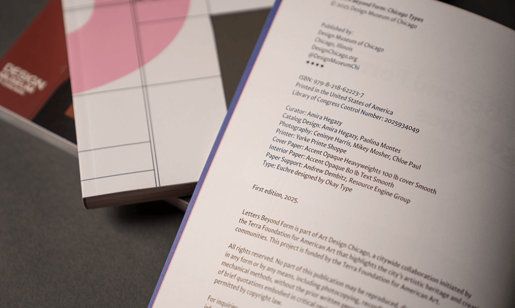
Cover: Accent Opaque Heavyweights 100 lb. Smooth
Pages: Accent Opaque 80 lb. Text White Smooth

The Overview
Collecting a History of Typography and Design
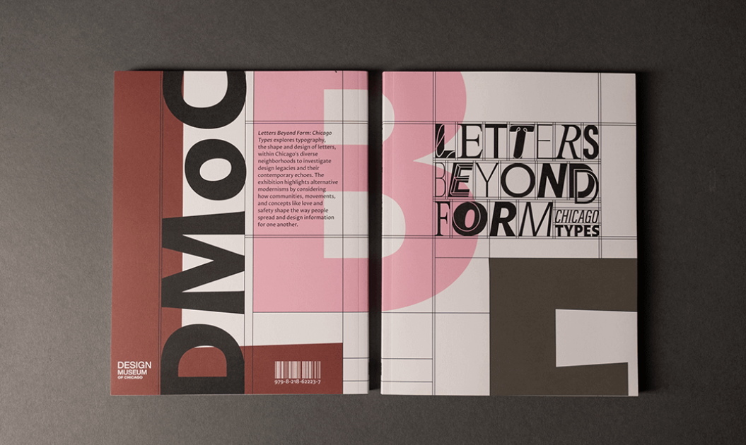
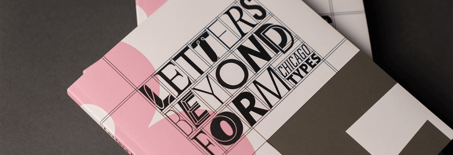
Chicago has a rich history of graphic art and design that is heavily influenced by the diverse mix of cultures and communities that make up the city’s neighborhoods. Celebrating this legacy via typography is what inspired the Design Museum of Chicago to curate an exhibit called Letters Beyond Form: Chicago Types, an eclectic look at what defines Chicago’s brand of type and design. At the conclusion of the six-month exhibit, the museum wanted to create a print piece that commemorated the exhibition and the community stories it surfaced.

The Details
Writing the Book on Chicago Typography
As a full-color, perfect bound book, Letters Beyond Form: Chicago Types does more than merely document the exhibit — it extends the conversation about the importance of typography and design in Chicago by including research notes that provide critical context for readers to understand the value of typography in the Windy City across a range of forms, from event posters to magazine covers to graffiti. The layout of the book maintains the vibrant, dynamic feel of the exhibit while also highlighting how typography and design helps communities communicate, collaborate and grow. The publication was shaped by years of community-based research, oral histories and close collaboration with artists from Pilsen and Bronzeville, reflecting the museum’s commitment to equity and inclusion in design.

The Results
An Artful Ode to a City and Its Many Shapes
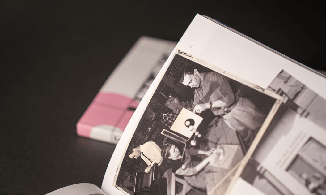
Blending photographs of the exhibit and the actual typography featured in the show, the book has an energy that captures the innovation and imagination that typifies Chicago-style typography and design — the book feels like a hybrid between a high-end retrospective and a piece of propulsive street art. The use of Accent Opaque 80 lb. Text White Smooth for the interior pages makes the designs and images leap off the page. The use of Accent Opaque Heavyweights 100 lb. Smooth for the cover lets readers know they’re holding something of meaning and substance — an artful ode to a great American city and its many shapes.
